Hi friends,
March issue of MAXIM is available on stand! Haven’t you noticed it? Believe me, its out & I have bought it!
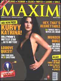
I know why you have missed it. It’s just because of the cover of this issue. No, it’s not because it’s not eye-catchy or it’s not so-sexy. It’s because it very-very similar to the previous cover.
Both the issues are having black (or blackish) background on the cover. Feb issue’s cover model was Kareena Kapoor and this time they have Katrina on the cover, but both in the black clothing. Apart from these two prominent components, the text on the cover is put as per the grid so it doesn’t create any differentiation. Similarly, Top band is exactly same in the both and that too in the same color.
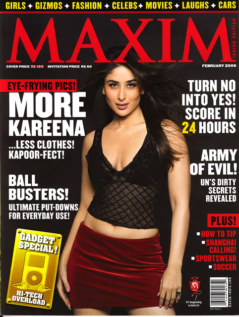

At a glance, one can easily miss the new issue until he is looking specifically for the new issue.
Unfortunately, we have done the same mistake in our publications also. We should avoid it! Specially, we should not repeat the main components in the same style in two consecutive issues like, background color, model/products/props, cover story style etc.
Regards,
GS Virdi

2 comments:
Hello..
I read your article. Good observation. I wish Maxim publisher and designer read this.
Still... somewhat I feel that you should not call it blunder! The designer could have thought that black background will look better with the image. Ofcourse, if the designer was smart, he could've tried some other combination to differentiate with previous cover, but, when you point out such things it would be your personal opinion can't be a blunder.
When I read the heading I thought some serious mistake happened with content or something! If an ordinary buyer spending money on a magazine, his decision will mostly be depend on topics or to some extent on cover model. What he got to do with colors and font size?
Thank you Mr. nambiar,
I will still call it blunder because this is not just a design or esthetic error but it caused a dip in news stand sale because it was so similar to the previous that a casual news stand buyer easily missed it. Obviously, a casual buyer is going to buy a magazine for its content not for the cover design, but what if he just ignore the issue becuase it is very similar to the previous one??? how would he come to know that he should pick the copy from the news stand and should have a look on the content?
And that is not at all an ignorable mistake, whether it is done by a designer or any editorial/marketing person. He should have take care of this aspect.
Anyways, thanks for sharing your views...Keep interecting in future also.
Regards,
G.S.Virdi
Post a Comment