Search This Blog

Saturday, December 30, 2006

My Mobile: This may be a blank call

Hi Friends,

All of sudden, one starts realizing that he has got enough information about a particular domain and he starts feeling strong urge to share it with others, and then he publishes a magazine to quench his thirst.

Result…?? Launch of poor magazine like- "India Mobile". Editorially- just a clueless and design wiz- absolutely pathetic, monthly magazine which is published & edited by Pradeep Shinde.

Despite of being a consumer magazine, it is carrying B2B kind of cover story and that too in its inaugural issue!! Poorly done product reviews are presented badly. Same is with other articles like- game reviews, features, tips, add-ons etc…all are disconnected to the reality.

I can't see any reason, why would this magazine be appreciated by any mobile phone buyer and that too a 52 page magazine at cover price of Rs.50?? No way!

I would like to mention its only competitor and just 9 months old, India's first mobile genre magazine- "My Mobile". At the same cover price, its well conceived, thoughtfully structured and neatly presented magazine..And its doing quite well (news stand vendors say so…:).

Let's see, "India Mobile" improves itself or it loses the signal and becomes unavailable ;-)

Further, since its year ending, there are lots of special issues of various magazines are lying on news stands. "Business Today" is celebrating 15th anniversary, "Cosmopolitan" has come with a bulky special issue this month and that’s it!

I think this would be my last posting for this year. I wish that next year will bring lots of new magazines, special editions, innovations, excitements to us.

A very Happy & Prosperous New Year to you and your family!

Regards,

G.S.Virdi

Tuesday, December 26, 2006

Double Silver Jubilee celebrations in this week

Hi Friends,

"The Week" & "Business World" are celebrating their 25th anniversary in this week and come up with Giant issues- "Double Issue" and "25 years of Business" respectively.

BW is carrying the cover story- "In 25 years…" where they looked back over last 25 years of changing faces of Indian business, problems & solutions and economy. Well, it becomes very easy to create such a compilation of last years when you have a huge bank of your previous issues (the way BW had 25 years or 52 weeks' issues per years) on the other hand it fails also to structure the complied content to build a nicely crafted and focused issue. It gets lost the direction of what they want to build up in this issue. Same I could feel while I was going through its three pages long editorial (written by Mr. Tony Joseph) where he sometimes talks about the BW product itself, sometimes he talks about the evolving business and sometimes he gets lost in talking about his personal moves and achievements. Well, it is justified to talk about the product on this eventful occasion.

172 pages big Silver jubilee issue of BW (at the regular cover price of Rs.10) has covered rather picked all the highlights from their previous issues. For a glance it gives you a nice feeling of remembering those golden moments through old pages of BW once again, but nothing else. But yes, it is good to have a glance now if you have missed them in their time. (http://www.businessworld.in/homepage/index.asp)

The Week's double volume issue 172 + 100 pages in total is comparatively a great compilation and its presented in a good way that each picked up looks like an independent and new article itself along with the support of time-line facts.

Volume 1 of TW has "Great Indian Renaissance" as cover story which is started with an opening note by PM, Dr. Manmohan Singh and covering almost every important sector where India has left noticeable impact in last 25 years. It includes Nuclear, Globliasation, Consumer activism, Space, Judiciary, Economy, Pharma, Beauty business & fashion, Sports, Automobiles, Media & Literature and IT & Telecom also. Mr. P Chidambaram, Mr. Milton Friedman, Mr. Uday Kotak, Mr. Aziz Premji and Mr. Mukesh Ambani also have contributed there columns in this issue.

Volume 2 of the same issue is carrying "25 ways to improve your life in 2007" by Sri Sri Ravishankar on the cover. The same volume is also carrying the most poignant moment from History as well as forecast for 2007.

In all, this double issue is worth to go through and that too at regular cover price of Rs. 15.
(http://week.manoramaonline.com/cgi-bin/MMOnline.dll/portal/ep/home.do?tabId=13)

Regards,

G.S. Virdi

Wednesday, December 20, 2006

Haute: Just another life style magazine!

Hi Friends,

Just came across another life style magazine- HAUTE…no no…its niether Haute Living nor Haute Dolls nor Haute Handbags… its a quarterly publication of haute media pvt ltd. and edited by ex-model and page 3 face- Queenie Dhody.

Haute is targeting to the premium class of society and will be catering jewellery trends (hmmmm…evreybody, now a days has eye on gems & jewllery industry), fashion and luxury, lifestyle and events. In the inaugural issue- Sep-Nov06- miss world Lara dutta was first cover girl and the issue was published in association with DTC- Diamond Trading Company and that's why issue is also carrying a welcome note by MD- DTC- Cherie Tandon Saldahna.

At a glance, this broad sized magazine gives me a mix feeling to like and dislike it. I like the wide range of articles/write-ups/feature they have put in the first issue- 34 plus and that too within 144 pages only (including ads). Its gives a feel of lots of reading material for a reader but obviously the kind of paper and content-pictures they have, they could do better production and design-layout also. In some articles it's done beautifully but in some articles it's inconsistent. May be, it's because of the first issue and they don’t have any proper style sheet yet.

Let's see with the next issues. Till then, you can share your views on the same.

Further, I have also got a glance of just-another-life-style-magazine on a new stand- HOT, yes it's HOT. It's again a quarterly magazine, I think at the cover price of Rs200 or Rs300 (I don’t remember right now). I saw it on a news stand but I could buy that time and now I cant find it. Its carrying one plain, completely plain orange cover and big HOT is written on the cover..That's it.

Has anybody got this issue and want to share it?

Regards,

G.S.Virdi

Tuesday, December 12, 2006

Multiple cover blunder!

Hi Friends,

It may be a good idea of publishing an issue with different covers for different TG sometimes, but it must be well thought, well calculated and well executed. Do you remember one of my mails in which I have mentioned the goofup in the Spine of MAXIM India. They had repeated the previous month’s spine in the next months cover. It wasn’t a small mistake because due to this mistake their complete plan for the year went into the drain.

It can be even more serious if you do such a silly mistake with the cover and cover story itself. Believe me, it happened with ‘Good Housekeeping’ in April 2006, when they were trying to test with two different Master heads on the same issue, with different treatment, with different color schemes for the logos, lower case-upper case etc… And it wasn’t end of the story.. they went one step ahead and they changed the cover story also. And obviously they needed to change cover model accodringly, where they put a dog’s picture in the place of Geena Devis’s picture.

And mind it, these ‘experimental’ changes were limited upto cover only…rest of the entire magazine was remained same…

…and that was the blunder!

In the content pages, on the page number 5 of the magazine, they had a caption- “On the Cover” refering to Geena and her make-up etc, while in fact few of copies were carrying a pritty dog’s picture on the cover!!

Cover with regular mast head v/s Two colors & lowercase


Cover with a dog's piture & the cover story with the wrong cover


(Source of cover images: http://www.mrmagazine.com/ )

So friends, be 110% careful about such sily mistakes which can set an example for others to learn:-)

Regards,

G.S.Virdi

Different cover for the different person

Hi Friends,

Its in the continuation of my last post about split covers, Redbook also changes its cover for different reader. And the change will depend upon various things like, the geographical area, where do you live in the country, whether you are a news stand buyer or a subscriber, whether you want to buy low price edition and so on…

Below is one example of the same where Redbook is available with four different covers. One had a flap on the cover with a few extra cover lines… One for the one dollar less price from the rest buyers…one was the traditional look at $2.99..

Regardless of reader’s choice, there is plenty on the cover of the magazine for him to pick from, but be careful, if he subscribes, he will lose sex from the cover. As a subscriber, the sex cover line changes to love.

Rest assured the inside of all four different magazines is exactly the same…including the missing sex from the cover of the subscribers' edition :)

News Stand Copy (with SEX) & Subscriber's Copy (with LOVE)

Left Flap (Extra stories) & Low Cover Price Edition


(Source of images: http://www.mrmagazine.com/ )

Regards,

G.S.Virdi

Multiple covers for the same issue

Hi Friends,

Publishers are trying double or Triple or Quadruple covers to attract news stand buyers. More and More magazines are going for this approach of giving multiple covers to the readers in the hopes that-
1. at least any of the cover will appeal to someone OR
2. someone will buy more than one cover with the same content ;-)

By the way, the magazine holding the record for the number of split covers for the same issue is TV Guide with their Star Trek 35th anniversary issue. That week they had 35 different covers.

Here are a few examples of such issues:

Entertainment Weekly (5 Covers)


Fitness (2 Covers)


Giant (2 Covers)


Bazaar (2 Covers)


Boca (5 Covers)


Golf (3 Covers)


(Source of cover images: http://www.mrmagazine.com/ )

Regards,

G.S.Virdi

Monday, December 11, 2006

G2: A Rich Gujarati Thali!

Hi Friends,

Just came across to another interesting abbreviation- 'G2'.

Do you know what does it stand for? OKi..Here is the clue... it is close to 'T3' :)

Still you are wondering…fine, let me tell you, it is recently launched lifestyle (not anymore, please!!) magazine but hey..hey..Its about all Shahs, Patels, Mehtas…I mean, its about Gujjus…Yes, it is 'G2- the Global Gujarati'.

G2 is launched last week by Cymbal Media, a magazine publishing arm of Lokmat Group (publisher of dailies in three languages- Hindi, English & marathi and LOKMAT is fourth largest read daily in India with over 10 million readers and no.1 in Maharastra), which is established to create up-scale brands to showcase fashion, beauty, art, culture, travel etc. G2 is the first magazine among them in an International size (yes, bigger than T3) and very good quality of paper. According to Mr. Devendra Darda, Exec. Director of Lokmat Group & publisher of G2, This magazine will be distributed in several international markets.

Editorial focus of G2 will be the community that owns a biggest business market in India and also built empires around the globe. If editorially this can stick to their mission and their focus, which will be good otherwise chances are very high to get diversified from their concept.

Inaugural issue of G2 is looking good…but not great. Good, because of size and paper for sure, but cover design is poor. Cover girl Hrishitaa Bhatt is looking good but designer has spoiled the beautiful picture by putting other objects very badly on the cover. Anyways it doesn’t go along with the philosophy of the magazine itself!!! At least in the inaugural issue, they should take care of the positioning of this magazine which is going to be- a magazine about successful gujratis (ad parsis also) they have put Hrishitaa (?) on the cover as Smart & Sassy!! Master head is also looks like ‘GQ’ magazine’s mast head.

At the cover price of Rs.125, 104 pages of editorial content look very shallow and unnecessarily stretched and same is with the TOC which is over stretched in four pages. Content Structure….??? Don’t even think about it…there is only section visible is lifestyle section which is the BOB of G2. Other stories are also not worth to mention.

At a glance, nothing can be appreciated other than the product quality in terms of physical aspects. Clients will definitely feel good to see their creative on such a good quality of paper and that too in larger than average size (and also if it reaches in large numbers of readers).

Regards,

G.S.Virdi

Friday, November 24, 2006

'Courage' means 'The Voice'...??

Hi Friends,

Just came across a news/general interest (monthly) magazine- COURAGE. It is 15 issues old magazine and has been published by Courage Publications, Prabha Devi, Mumbai.

Well, in short, I didn’t find anything remarkable or noticeable in this magazine until I looked upon its Hindi edition! I was surprise to see that its Hindi edition has English title!!!

You might be aware that I have been working & watching very closely bi-lingual content (specially, English-Hindi) since last seven years. I know “India Today”, “Outlook”, Osho Times”, “StarDust”,”Gr8”,”Cricket Today”, The Sunday Indian”, “Satellite@internet India” and of course “Overdrive” & “Better Photography” are lots of other English magazines, which have English titles for their respective Hindi Editions. But, these all have kept the same name of their English edition, no one Hindi edition is carrying different name from the English edition. Either they have kept the same name or if they have changed, then they have given new name in Hindi for their Hindi edition. For example, “New Woman” has “Sangini” or “Times of India” has “Navbharat Times” or “Hindustan Times” has “Hindustan” etc.

But here, I saw a unique title- “THE VOICE”, which was in written in Hindi script for a Hindi Edition of an existing English magazine- “COURAGE”. I can understand that if one magazine in English is already established in the market and has got a decent brand recall by name itself, its always good to keep the same name for its Hindi Edition, But just cant see any reason to keep it different and that too not in Hindi?? Interestingly, both the editions of this magazine, English and Hindi, were launched at the same time last year and are kept the same cover price- Rs 20.

Please share your views/opinion on this or if you have also come across similar kind of instance in some time.

Keep Reading :-)

G.S.Virdi

Aaaii T3...

Hi Friends,

Just hang on… I am not talking about T3…:-)

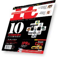
It is- Information. Technology. Today. Tomorrow. The tagline of I.T.- Information Technology Magazine.

The word “Information Technology” is become so broad now a days that it’s almost impossible to manage the content structure for any monthly magazine like ‘IT’. You might be aware that “I.T.-Information Technology” is published by EFY Enterprises Pvt. Ltd., who is also publisher of- Electronics for You, BenefIT, Linux for you, ePOWER, Facts for you etc.

I.T. has completed its 15years of publication this month and latest issue is available on news stands at cover price of Rs.30.


Well, magazine has already lost its charm long back though EFY still has some recall because of lots of Engineering/Diploma students and LFY because of very limited but still loyal, Linux lovers in count. IT seems very confused editorially or lost somewhere because of the fast expansion of technology domain, which can’t be covered in 100 pages monthly magazine et al. I think IT should have done their product re-positioning exercise long ago. As of now, product seems unorganized collection of everything, which has technology in it- whether it is consumer or enterprise or storage or application or networking or OS…everything. Even they try to cater a very broad user base in terms of skill level, from a novice to Administrator level. And that is why magazine doesn’t appear with sharp focus and clear-cut road map.

May be, this is because they generate content with the help of readers whom they appeal in every issue to send their articles on “Technology”; yes, anybody who can write about “technology-related” issues, can send his write-up for IT editorial. No wonder, they are publishing the mix junk cocktail of what they must be receiving.

Design and layout is also poor. For a change, they have put new master head on the cover this time. Let’s see, if it is for this special issue or it’s going to be like this only. Style-sheet seems alien’s term to their designers, that’s why you can find lots of ‘experiments’ and inconsistencies on every other page.

Still they are enjoying and celebrating their 15th anniversary. Issue is with me, if you want to have a look.

Keep reading :-)

G.S.Virdi

Wednesday, November 15, 2006

Men's Health: A 'complete diet' for Indian men

Hi Friends,

After touching the sales of four million in 43 other countries, Men's Health is reached in India. The India Today Group has launched this Indian edition at cover price of Rs.50 in this November 06.

Well, I like the inaugural issue of "Men's Health" so much that I can refer it as a complete dose for a man. It is carrying information & tips Men's fitness, health, nutrition, sex, relationships, style, fashion, gear…! I found it very content heavy, you really find lots of things to read in it…and most importantly, all the articles are very short and tightly written. That's why, I personally like that one can easily go through any article if he likes and if doesn’t like it, he doesn't lose so many pages from the magazine.

In this way, inaugural issue is carrying 36 features/articles apart from the regular sections/columns. Magazine's content richness starts right from the cover which is carrying 15 different stories on it and one big picture of Sameer Sharma, a model. Though, we are not used to see this kind of text heavy covers on one hand, but here, after going through the issue, it doesn’t look over-written. It seems justified.

Cover design is excellent in that way, they have used very smartly, two fonts only, to put this much text on the cover. They have used 'numbers' also on the cover in lots of stories like- 9 Rules you must break today, 7 Life lessons by SRK, lose 23 Kg, 26 Style Tips, 4 Brain Boosters, 1 Fat-free butter chicken…

Oh yes, forgot to mention that the cover story for the inaugural issue is "MH Int'l SEX survey" and the complete article is sold to KS…:)

And looking at the content density and quality, cover price also seems justified.

BTW, You can see a dummy issue of "Men's Health' at http://www.menshealthindia.com/template.htm.

As of now, I think it can get the position for men, which has achieved Cosmopolitan for Women…Lets see. Share your opinion also.

A copy of inaugural issue is with me, if you want to have a look.

Keep Reading :)

G.S.Virdi

EK aur EK GYARA

(was written on: October 12, 2006)

Hi Friends,

I have been always admiring content quality, presentation, editorial approach of OUTLOOK group products, whether it is Outlook Weekly or Outlook Travellers or Outlook L&S or Marie Claire or any special or anniversary issues.

We have seen Outlook weekly’s 10th anniversary issue was Giant and it was superb in terms of editorial content. On the contrary, India Today hasn’t reached even closer to the quality of Outlook’s specials.

Anyways, 11th issue of Outlook weekly is released last week. It is good and worth reading because of various columns from top journalists. At least not look alike 11 this, 11 that and all stupid compilations. Other than that it is bundled with free copy of inaugural issue of MUMBAI CITY LIMITS, another city magazine. I must say, it is what actually disappointed me. I couldn’t expect such a poorly structured magazine from Outlook. It is not worth of a look even it is coming free with outlook. I cant see any reason to buy it, if they planning it to sell separately on the stands. Its Competitor, SIMPLY MUMBAI is still coming free with INDIA TODAY, which is far better than this new launch. If I would have to buy a city magazine, I would buy more informative and interesting INFOMEDIA CITY GUIDE or MUMBAI TIME OUT.

And BTW, This month’s MAXIM is also released and guys, this issue is not just a Bomb, its DYNAMITE!!! If you want, you can check with me before it gets exploded!

Keep Reading:)

G.S.Virdi

'&'

(was written on: October 10, 2006)

And-per-sand, distortion of the word Ampersand or the symbol '&'.

Friends, another more-than-luxury-lifestyle magazine is launched in India, Miami, Amsterdam and Dubai simultaneously. It is published by Miami based Maxposure Media Group, LLC and in India by Publisher, Vikas Johari (& Associate Pub. Prakash Johari). Initially it is launched as a quarterly magazine in Mumbai and later it will be launched as bi-monthly and across the nation.

Mission of the Magazine:
& is set to be the next great global phenomenon by going beyond the buzz to bring you the best of what the world has to offer and flaunting creativity to the max. It was created for diverse, forward-thinking, affluent professionals, ages 25-49, with a bevy of disposable income and a sense of style to match. This international jetsetter with a "work hard, play harder" mentality loves fashion, diversity, technology, luxury goods, interior design, the arts, fine dining, the world's booming party scene & more.

The name '&' was conceived under the philosophy that there’s always more and the best way to unite two things – even total opposites – is to place the symbol “&” between them. They believe & is the medium to connect their readers to the rest of the world and vice – versa.

Well, Indian edition is priced at Rs150 for 142 pages, while Miami edition at $5.95US for 176 pages. Print run for this quarterly issue is kept 16,000 initially. This magazine will be distributed through various channels like though IBH for news stands, through various events for lifestyle & luxury things and through awards show like SMART LIVING in Mumbai (Nov) and Jewellary awards in Delhi (Dec). Same events will be covered in the same magazine also. They have tied-up with Times event division-360 degrees.

Apart from this, magazine will also be placed at various hotel chains like The Park, The Radisson, The Crowne Plaza, Le Maridien etc. The logic was to get the magazine in the right hands – of those with disposable income and with a sense of style and lifestyle. Also, value-added services to advertisers are on the agenda. The magazine is looking at a lot of PR activities and luxury-brands related events. Johari claims that the magazine is here to set never-before-seen standards in its luxury segment.

The magazine will cover major areas that touch any lifestyle-conscious consumer like fashion, automobiles, travel destinations, hotels and resorts, art and architecture. The inaugural issue will feature a Dubai-based resort and Austria as a travel destination. It will also showcase well-known painters like Riyaz Khan, Anjum Singh and Baiju Parthan. That apart, beginning with this issue, every issue will carry two photo shoots. This issue will feature models Bipasha and Sunalika under the theme ‘Too far west is east’. This will essentially bring out the trend of the west looking at India for fashion and ideas, explains Johari. In contrast, it will highlight how Indian designers are emulating western styles.
In short, magazine is divided into various sections like People, Fashion, Design & Architecture, Features, Art & Culture, Destination, Encyclopedia etc.

Issue #1 of Miami edition is with me (can't find indian edition around, if somebody find, please share), just in case if you want to have a look! You can also check http://www.andpersandmag.com/.

Keep Reading :)

G.S.Virdi

Confetti: Life's a party!

(was written on: October 7, 2006)

Hi Friends,

I am not saying, but it’s the tag line of recently launched magazine- CONFETTI. Confetti is a lifestyle magazine… No..no…lifestyle here doesn’t mean like “m”, “OK”, “Man’s World”, “Maxim” or “Cosmopolitan”…here I mean- art of living.

There are few other magazines already there in this space but only one or two are the popular one which you can recall, like- “Life Positive”, “Osho Times”, “Harmony” etc. CONFETTI is also carrying the same content in different sections- Love, Life, Lust, Relationships, health, for Him, for Her etc.

Edited by Lyola Thomas and published by Vinod Srinivas Confetti is priced at Rs 50, which is quite high looking at poor quality of content and presentation as well. Only good thing about this magazine is the quality of paper used for it :).

Inaugural issue is with me, just in case you want to have a look.

Keep Reading :)
G.S.Virdi

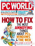
PC World has opened its wings in full capacities

(was written on: October 6, 2006)

Hi Friends,

You might be aware of PCW India (Pub: IDG India, Bangalore) was launched 4 months back with lots of noise and edit-marketing-distribution innovations. It was India’s first magazine which was providing free Dual Layer DVD along with the every issue at special inaugural price of Rs60. For distributors also IDG had announced some incentive scheme to push it hard on news stands.

So far, it seems that all is going well as per their plan. This week, 4th issue, the MEGA issue of PCW of 260 pages – BUYERS GUIDE SPECIAL is released at the increased (and now regular) cover price of Rs100. I must say, editorially it is the superb issue!!!

Cover story is “WHAT (NOT) TO BUY- expert advice on selecting the RIGHT gadgets & PC gear” which is crafted very well keeping festive season in the mind. From camcorders and cell phones to hard disks, motherboards, desktops, laptops, PDAs, home theaters to hi-fi speakers and MFDs…everything is explained along with the demystifying sales jargon and without giving long-long tech-specs which rather make readers more confused.

Other leading stories are on buying Digital cameras, upgrading your existing PC, 50 ways to get more out of your applications and 11 pages of easy tips. Along with the regular product reviews, news & trends this issue is carrying a wonderful special section of 58 (yellow) pages- Visual Workshops, which are nicely laid out step-by-step DIY kind of workshops.

In all, its really a collector’s issue for any prospective buyer, whether he is geek or layman. Issue is well planned & also well designed.

Well, PCW is trying hard to get back its reputation & position which it had one and half decades before. In this mega issue, they have managed to bag around 45 pages of ads along with some good deal with Google. That’s why beautiful & notable packaging of this issue has branding of Google on this face & back of the pack. Every issue is also carrying Google Adword’s coupon worth Rs.1000.

I would also like to mention here that Dual Layer DVD with every issue is becoming a USP for PCW, according to news stand guys. This issue is carrying video from editor along with a video tutorial plus google utilities. Apart from these it has lots of full products & full length movie- The Street Fighter.

Latest issue is with me, just in case you want to have a look.

Keep Reading :)

G.S.Virdi

The Sunday Indian: ...now he is MANAGING the NEWS!!

(was written on: October 6, 2006)

Hi Friends,

Do you know what is common among fairly successful business magazines- “4Ps- Business & Marketing”, “Business and Economy” and Sunny Deol starrer bollywood masala film- “Rok sako to rok lo”???

Well, if you don’t have any idea, let me tell you that all of these ventures are outcome of the brain of Management Guru and the founder of GIDF (Great Indian Dream Foundation), a PR firm- ICPAR and an ad agency-Planman life, Prof. ARINDAM CHAUDHURI.

In the last few years, we have seen lots of new arrivals of news based ventures in news papers, magazines and TV channels, Arindam is also trying his luck in the same. His latest venture is launched two days back in the form of a weekly News magazine- THE SUNDAY INDIAN. This is world’s first magazine which launched simultaneously in five different languages- English, Hindi, Bangla, Tamil and Gujarati. His 68 men edit team is headed by Sharad Gupta & Vijay Simha. Other prominent names are- A. Sandeep, Sutanu Guru, Prasoon Majumdar, Prashanto Banerji and Malay Chaudhuri.

Arindam also recognize the challenge of competing with other established news magazines and mainly he quotes India Today, but he is confident the he will make a difference as his editorial’s title itself claims-We will change your outlook (though his movie’s title was also very arrogant, but it fall down very badly…I hope that the same would not be happen with his magazine).

Well, first issue is released and it is looking really well designed and well thought magazine if I compare it with last year released other few magazines like “Senior India”, “Har Shanivaar” and “Santulan” etc. Inaugural issue is consisting of 74 pages which is smartly divided into various important and relevant sections for International and national affaires, Special reports, Features, Sports, Economics, Columns, Films & Theatre, Lifestyle, Relationships, Books & CD/DVDs and Gossips. Content is well analyzed and pages are also beautifully laid out which give an ease while reading. But, Master Head and cover design is poor.
Since, he is a good PR person, he has managed to receive letters from Chandra Shekhar (former PM), Bhairon Singh Shekhawat (VP of India), Sharad Yadav (President JD), HD Deve Gowda (Former PM), Girija Vyas (Chairperson, NCW), AB Bardhan & D Raja (CPI) and Sitaram Yechury (Rajya Sabha MP) which are published in readers letters column.

Overall, The Sunday Indian at Rs.20 is worth to buy. I hope that even if it cant beat India Today or Outlook, still will be able to create its own space in the market. I have seen the fast pickup of the inaugural issue last night in one hour’s time at one book stall in Navi Mumbai itself. It may be because of advertisement of its launch which you can see on IBN7 channel also.

Its Hindi & English versions are with me if you want a have a look.

Keep Reading :-)

G.S.Virdi

3rd 30th Anniversary issue in One year!!!

(was written on: September 23, 2006)

Hi Friends,

Its about celebrating your birthday four times in a year and getting more n more gifts from others. As long as throwing a birthday party is profitable enough, I don’t think it’s a bad practice. If your guests are happily ready to come in your party and they are not coming empty hands, they are bringing gifts for you, keep celebrating more anniversaries or special occasions.

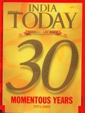
'Third' 30th anniversary issue of India Today is now on stands. You might remember that yours truly has written his feedback on its previous 30th anniversary in the month of June. First issue of this chain-of-30th-anniversary was released in the starting of the year 06.

Reading Aroon Purie's page is simply waste of time! Same could be written by any of junior journalist who could be given the TOC with the instructions of writing around 400 words about the issue only! Or may be Aroon had nothing to say special for this time in his 'third' special issue. Well, I was expecting something thoughtful from his desk, I got disappointed.

You can sense the entire story by the beginning itself. As you go through the edit page, content pages…you start having a feel that you are reading previous anniversary issue only…the same BEST 30s of everything… from 30 best Readers letters to 30 living treasures, 30 momentous events, 30 perfect shots, 30 fade-outs and lots of other NOT-SO-USEFULL 30 things…

Not only this, but even you start sensing that edit & design team of IT also might be asked to do this issue forcefully…design & layout of pages is shouting itself that this issue is the outcome of overtime!

Any media publication with this much seniority can very easily generate such a scrap-compilation of 186 pages from its archives of 30 years issues. I really can't find anything so-great-so-special in this issue.

Though, IT special issue is available at the regular cover price of Rs.20, but I would not suggest you to buy it. Yes, you can buy it for a complimentary copy of SPICE which is free with this issue and carrying SHOPPING IN SINGAPORE as cover story.

If you want to have a look upon this mega issue, you can request to Chitra (DA) who obliged me by giving this issue to me even before she could get a chance to rip apart it.

She also highlighted one interesting characteristic of the editorial is that articles and reading pieces are very short and crisp in this issue so that they do not bore the reader, I completely agree with her. May be, we should take care of this point in our won magazines also.

As I said, till the money is coming by doing such a non-sense special issues, why shouldn’t one do this…If getting money only is their mission!

Keep Celebrating :)

G.S.Virdi

Naya. Aur Bhi Behtar. Better Interior!

(was written on: September 21, 2006)

Trust me…I am not getting biased that it is our own magazine nor I am trying to impress BI team's Girls!

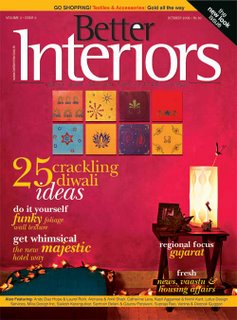
Just got the chance to have a look on the latest (October 2006) issue of BI. It is really a wonderful & clearly noticeable makeover, exactly the way it should be. Not only cosmetically but editorially also, right starting from Editorial to Resource Zone, every section is clearly face lifted.

Sections names are changed in such a way that they are very clear to state their usability & the nature of content they are carrying. In this way, I think BI seems a practical guide for a reader who can learn & do himself instead of considering it as a catalog or showcase only.

Cover story- 25 DIY ideas for Diwali is a really very practical & relevant story, which can make a deep impact on reader's mind if even a single idea clicks to a reader and he implements that to décor his home. Other sections like- design matters, at home (for residential), at work (for commercial) and at ease (for hospitality etc) are also well presented & look useful.

Lay out of each article is improved and a more informative and well presented, credit goes to Mona- Sr. Designer.

Let me confess that I needed more time to go through this issue in detail, but couldn't stop myself to share my first feelings with all of you. I would request all of you editgroup members to grab the copy and share your opinion and feedback with us. Not only for the sake of editorial feedback, but you would definitely love this issue, if you are planning to shop or interior work for your home on this festival.

Brilliant job done by Rupali and her team…Keep it up BI Girls!

Keep reading :)

G.S.Virdi

T+L SA: India is the next destination...

(was written on: August 29, 2006)

It’s launched last week in Delhi and today in Mumbai.

T+L SA at a glance:

Title: Travel+Leisure South Asia
Periodicity: Monthly Cover Price: Rs150. Pages: 160
Publisher: Media Transasia India Ltd. (also publisher of Swagat, Golf Style, Discover India, Architecture + Design, Indian Design & Interior and MAXIM)
Editor-in-chief: Payal Kohli (Ex-editor of Cosmopolitan)
CEO: Piyush Sharma
Publishing Director: Rasina Uberoi
International Edition: Sixth (Other five are- China, Turkey, Mexico, Russia and Australia in addition of US original)
Distribution: India, Sri Lanka, Bangladesh, Nepal, Maldives, Pakistan & Bhutan.
Positioning Statement: “Lifestyle behind the Travel”
Tag Line: Takes You There
Target Reader: Sophisticated, modern and discerning reader with a high disposable income and consumption. Clearly- for the travelers not tourists.
Promotion Plan: Claims to have spent Rs. 3crore in print, online and outdoor.

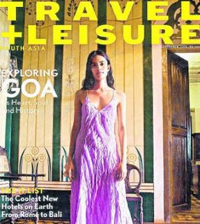
I have got chance to go through the issue, it gives me a mixed feeling about the magazine. Well, content is superb in terms of horizontal coverage. T+L’s editorial will cover everything from food to wine, architecture to design, and technology to luxury apart from the global traveling. But I am not impressed by the editorial structure & design. It could be far-far better in terms of presentation & packaging if one is provided such a huge treasure of content. I found structure very unfriendly and blurred to the reader and I think that is why Payal had to explain the columns in her Edit note.

Cover story of inaugural issue is ‘Goa Unseen’ by Sonia Faleiro and article is supported by beautiful photographs by Prabuddha Das Gupta. Other features like- “What defines a great hotel now?” and “Jewel of India (Kerala would be the obvious choice for anybody to start with)” are also quite interesting.

Other interesting sections/columns are Stylish Traveler, Insider, Update & Strategies. Inaugural issue is carrying a special report on “T+L’s Business Travel guide” which gives an overview of coolest travel accessories and their optimum usage. In this section, technical contributor is Rajiv Makhni, who also hosts two Tele shows on NDTV named- Gadget Guru & Digital. In the same issue, ‘Strategies’ is helping you to plan a last-minute trip to England, including booking tips, flight maps, road signs, Driving rules guide, shopping guide etc.

T+L claims to sell around 1.3 million copies to over 6 million readers. Print run of South Asian inaugural issue is 80,000 and advance paid subscriber bas of around 20,000.
Indian edition is printed on very good quality of paper (somewhat like Spenta uses for JETWINGS) and looking upon the content (if you ignore the design and presentation) its cover price is justified (I know, Sajith doesn’t think so). This product has to be at very high price to justify the kind of positioning they are marketing and the kind of reader profile they are targeting.

Friends, just go through the issue and share your opinion.

Regards,G.S.Virdi

BT (mange) MORE!

(was written on: August 14, 2006)

Dear Friends,

Lifestyle is become a buzzword now a days. Everybody and everyone is talking about lifestyle. I remember, we had to lose a few good designers and copy desk joinees just because they wanted to join a lifestyle magazine!!

The word lifestyle is reached at the level of our DNA of our society. The same was realised by Editor-in-Chief, Aroon Purie when he heard this word from his barber.

Last week another lifestyle magazine, BT MORE is launched by the Living Media India Ltd. Mr. Purie position this magazine as a magazine which will keep readers informed about the trends & the products that affect their lifestyle both at work and home. Every issue will be theme based.

Guess what they would have selected for the inaugural issue as the theme??

Gadgets & Gizmos…what else!!! From laptops, to mobile phones to digital cameras to personal music players to LCD/Plasma TVs to DVD players to Speakers to what not!

Well, content looks good, but not the layout & design. It could be far superior as it has broader sheet magazine. Center pinned issue of 74 pages is carrying 23 ad pages.

T3 guys, your cover has got competition now!

As of now, it’s a BI-monthly magazine and being distributed FREE with the regular issue of Business Today i.e. you can get this inaugural issue in Rs.10 only!

Regards,

G.S.Virdi

WHATCAR India for Non-Metro & Smaller Towns!

(was written on: August 14, 2006)

Dear Friends,

After running WHATCAR quarterly at Rs.100 for a few issues, Haymarket SAC Pub. (India) has launched the same magazine on this Friday with some significant changes in it.

Changes in terms of pages, cover price, frequency of the magazine etc. But, all changes are made to assure that this new magazine will be more relevant for readers and will sale more.

To achieve this, they have released this magazine as a BI-monthly magazine as it was Quarterly earlier. They have reduced cover price also to Rs. 30 from Rs. 100.

In the Inaugural issue's editor's note, Editor Hormazd quotes very clearly that it is the magazine for a common man hence the language used is not understandable by a car expert only. On the same page clear cash benefit through this issue is mentioned. I appreciate the first two pages after the content page, where they have explained the usage & benefit of this magazine very clearly. They have tried very smartly to build the rapport of the credibility of the editorial content with the readers by putting- Promise to readers, How to buy a car with WHATCAR, explaining rating etc.

I liked other features in this issue are-
· How to adjust your seat
· Hot Deals in various categories like- Hatchbacks, SUVs/MUV/s, Premium Hatchbacks, Estates, Mid Sizers, Luxury cars..
· Buying Tips
· What can I buy for… Rs.XXXXXX
· Cut your Fuel bills
· Reader Test Team etc.

Apart of these, major attraction is one of the cover stories. It's about The Tricks Dealers Play On Buyers. Needless to say that its BUYER'S GUIDE is extremely redesigned, self explained and more informative such that its not only containing the facts & figures with prices, but it also carrying buying tips & selling tips, how to use buyer's guide, DOs & DONTs to get the best deal.

Inaugural issue of 86 pages is managed to get 17pages of Advertisements.

You can have a look on this issue as its with me.

Regards,

G.S.Virdi

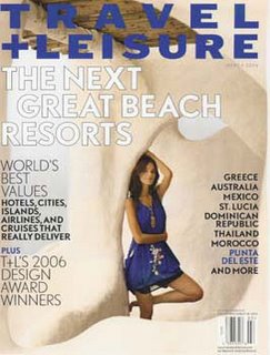
Travel+Leisure: India is the next destination...

(was written on: July 25, 2006)

“Travel+Leisure, the world’s no.1 travel magazine is now in India”, as they are creating noise!

Another PHOREN publication’s (American Express Publishing Corporation- http://www.travelandleisure.com/ ) Indian version is ready to be launched in August by Media Transasia India Publication (also the publisher of Swagat, Golf Style, Discover India, Architecture + Design, Indian Design & Interior and National Review- closed now) .

You might remember that this year in January, they have launched MAXIM which has already raised bar for lifestyle magazines.

Travel+Leisure South Asia, which will be targeting on Technology & Photography along with luxury, design & style, Driving, food & wine etc. Starting subscription offer of 50% is available on http://www.travelandleisure.indiatimes/ .

And BTW, I have bought latest issue of DEBONAIR, because it has “NEW LOOK” star burst on the cover. I am wondering if anybody has some older issue of the same so that I can compare the changes they have made.

Keep Reading :-)

G.S.Virdi

DANGER for Special Interest Magazines!!!

(was written on: July 19, 2006)

Hi Friends,

Really it is!

Whenever we think of our respective competition, we think of other magazines that cater directly to the same audience of ours. Like, when we think about the rivals of IC CHIP, we think of digit, PC Quest or PC World (recently launched) etc only. Whenever we start counting competitors of Overdrive, we count up to Autocar, Car, BS Motoring, TOP gear only. Similarly, Better Photography can see up to Smart Photography, Asian Photography, Times Journal only, Better Interior can count Inside Outside, Society, Elle Decor etc.

But if we asked twice to identify more, then we start including other mediums like Internet, TV, Radio etc as emerging competitors.

We often forget to recognize our biggest competitor in this exercise who is eating our market share very calmly, our readers as well as our revenues. And that is main stream print media- News Papers, who are serving the same kind of content in the form of weekly supplements or regular sections or special features to the same audience; to “our readers”, for those we claim (rather THINK!) that they are very loyal to us, they can’t leave us…!

We need to remember all the time that we are in the business of Special Interests, whether it is Technology, Automobile, Photography or anything. And we are holding “our reader” through this thin thread of his Special Interest. The same reader may have other interest also, like, one tech geek may have interest in Photography also, he may have interest in House keeping or in automobile or in cooking or in fashion or in gossips, or in travel etc..

I mean to say, this “our reader” has lots of avtaars within a single reader. And “our reader” may have tied up with so many thin threads with so many content sources. And everybody is claiming that this is “his reader”! Yes, I do agree that there is no harm if he is being pulled by another interests strings in other directions, until he consider our direct competitors (for the time being, I am considering the only content sources which I have mentioned in my first paragraph) as an alternate option.

And there we have a major threat! The main stream media can hook “our reader” in stronger way as he can get a kind of satisfaction for all of his avtaars in those news papers through various supplements on various interests.

This small and subtle danger is growing now. Its getting bigger with the newly launched various Life Style magazines. Believe me, all of them are carrying the same topics, which we think that this is our core domain, this is our strength, this is our domain of specialization…!

I would wonder if “our reader” can’t buy a dedicated magazine for each of his avtaar, why should not he move to such life style magazines, which are providing him content feed for his almost every content need? Yes, we can defend ourselves by a statement that we give them In-depth/well researched/authentic information! Still, we are very close to lose “our reader” if he gets the same taste from these kind of magazines, because in these magazine, he will be hooked by so many avtaars to so many threads.

I would like highlight a few data to advocate my feelings. In this year only, we have seen the launch of so many life style magazines like, Maxim, Marie Clarie, “m”, “OK” etc. And every magazine is catering about gadgets, automobile, photography, interior, AV, travel, fashion and what not. (You can refer one of last month’s IMPACT issues).

Approximately 250 pages fat, latest issue of ‘M” is released yesterday. I can’t see any reason if a CHIP/T3 reader, who loves to know about gadgets, doesn’t fall in love with “M” which is carrying 18 dedicated pages on it. Why would not a Photography enthusiast appreciate 10 pages showing classic work by veteran Photojournalist-Pradeep Chandra? This feature is carrying master pieces of his work along with the description of Camera and other specification. Other than that, this issue is featuring photographs in the form of 16 pages long retrospective on the Pirelli Calendar! Any auto enthusiast would definitely love to go though 9 pages of HOT WHEELS (regular section) which is featuring Harley this time. Same issue is carrying Honda Gold Wing also!

Similarly, this issue has lots of masala for AV Max readers also, apart from regular sections and other interesting stuff like ‘Sexiest Woman survey’, interviews with Prahlad Kakkar, Travel Bling etc.

Same issue has managed to bag 33 pages of Advertisements apart from so many sponsored/branded/advertorials/innovations.

As you keep surfing on this issue, you start feeling that this particular page/section would definitely appeal to “my reader”.

And this might be an alarming feeling!

Keep reading :-)

G.S.Virdi

(Im)perfect planning!

(was written on: June 30, 2006)

Hi Friends,

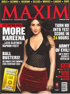
Second blunder in MAXIM! No…no…Khushboo's picture morphing wasn't the first one! It was the spine of the magazine, which was repeated by mistake and their entire year's plan went into the drain.

Lesson: Perfect planning requires perfect execution. 'Long term plan' can be derailed by some silly mistakes, so we should be extra careful for even small things.

Their short term plan also didn't work well. They had published the cover-shot in various magazines as a teaser ad for June issue of MAXIM. On the cover they had shown Koena Mitra's photograph for their regular section called 'Sexy Girl Overloaded'.

In a way, it looks fine that they are so planned that they could made cover well in advance and they can market as well. I think, they went one step further and they printed actual cover for entire print run in advance! Well till now, everything looks perfect & smooth going.

God only knows, what went wrong after that and when I saw the actual June issue of MAXIM, it has a sticker pasted on Koena's photograph and some another girl- Natasha is featured. Probably, due to miscommunication or lack of co-ordination between Marketing and Editorial teams! So, MAXIM's latest issue is available on the news stand with a sticker on the cover!

Lesson: Perfect planning requires perfect communication also to be implemented perfectly!

Regards,

G.S.Virdi

10 on 30...

(was written on: June 28, 2006)

Hi Friends,

Remember OUTLOOK’s 10th anniversary issue??

All I can say, editorially, it was a great issue. Superb collection of master piece write-ups from the legendry journalists, which could be a great institution in itself for many of us. I could see a great efforts & perfect planning behind the issue, which really made it a collector’s issue for a reader.
This week, INDIA TODAY has completed its 30 years long journey and come up with 186 pages heavy 30th Anniversary issue. Again, Its good, its collector’s issue (as they claim), but despite of being a leading media house, big brand, long existing credibility, it’s not at par where Outlook’s was.

Yes, “India Today” has put lots of efforts to compile many 30s like- 30Golden Moments, 30 Famous Quotes, 30 Scams, 30 Political Moments, 30 monuments, 30 destinations, 30 design Ideas, 30 TV characters, 30 powerful advertisements, 30 Romantic scenes from bollywood, 30 TV characters, 30 famous bollywood dialogs, 30 restaurants, 30 economics miles stones, 30 cool gadgets, 30 yesterday’s headline grabbers, 30 artists and so on…and it makes it really very interesting to read. But it’s for once only. It’s like you are reading some news paper supplement on casual basis and then you don’t require keeping it for reference; I mean it has no reference value which I found in Outlook’s issue.

I would like to mention one great thing about this issue is its copywriting. Many of us can learn to write better copy, catchy headings, powerful subheadings within very limited words. Apart from Mr. Arun Purie’s edit page, guest pages by Amartya Sen, Ramchandra Guha & Dominique Lapierre are also worth to read.

Not comparable with Outlook’s issue, still IT’s 30 anniversary issue is worth to go through once. Don’t miss it!

Keep Reading :-)

G.S.Virdi

MAHAA MID-DAY!

(was written on: June 27, 2006)

Hi Friends,

If you have courage to read on and on and on… today is MID-DAY’s 27th anniversary which they are celebrating by giving you 264 pages of reading stuff in Rs.10 only!

Keep Reading :-)

G.S.Virdi

What were they thinking?

(was written on: June 8, 2006)

Hi Friends,

Reader’s Digest has released “21st Century Woman special” this week as first issue in the series. It has “RD Special Collector’s Edition” logo on the cover and size of the magazine is not as the regular pocket sized RD has, it is in the size of India Today regular magazine.

According to Sathya Sharan (consulting Editor), she knows very clearly that woman wants the best in everything and she has put the best in the same issue. Well, after going through the issue, I am wondering what was thought behind this very odd special(?). Its absolutely disappointing for a regular RD reader. I just could not relate it with the RD regular. Otherwise, it has Jewellery, Dishes, Money, Career, Hosting, Parenting, Travel etc in editorial content.

Looking at the content & design, its really a collector’s issue ;-) You should keep this issue always in front of your eyes to remember that these things you should NOT do in your magazine. Same is with the design & layout. It can be used as reference book for every designer to NOT to follow the things. Cover is equally poor. I know, RD regular is also not known for great covers, but here its worse. Badly laid out & placed cover stories and other elements on the cover…its horrible.

This 136 pages big special issue is priced at 50Rs and they have managed to get 17 pages of Ads.

I would not recommend anybody to buy this, its with me if you want to confirm my opinion.

Keep Reading:)
G.S.Virdi

SUPREMACY- A Gujrati Thaali!

(was written on: June 26, 2006)

Hi Friends,

If everything is covered, they call it- General Interest Magazine. Publisher Sunjeev Maheshwari has made his Hat-Trick this week with the launch of their third publication in six months duration- SUPREMACY. It covers- Everything! It targets- well, Everybody!

This 82 pages monthly magazine is trying to feed everything to everybody in 30Rs. It has Politics, International affairs, Diplomacy, NRIs, Business, Investment, Health & Fitness, Careers, relationships, books & food and what not. Editor Ajay Kumar dreams to make this magazine to position as a mirror to the culture & society (?)!

You might be aware that in January of this year, Mr. Maheshwari has already banged the news stand with the magazine "The Observer Of Management Education" followed by the launch of niche(!) Hindi political Magazine "Ekta Chakra". Unfortunately, I haven't seen either of those two.

I am confused what is poorer in Supremacy, content or production quality? Still, if anybody wants to have a look, its with me.

Keep Reading :-)

G.S.Virdi

Chhoti Si Bhool...

(was written on: June 12, 2006)

Hi Friends,

Have you noticed the mistake done by ‘layout’ guy on the spine of the latest issue of MAXIM?

He has repeated the same background on the spine, which was already, used in two issues back. And this is not the mistake whose impact will remain within this issue only, but it has swiped their ‘long term’ idea which they were planning for the entire year…

It always happens, even after lots of cautions & checks…So we need to more careful before sending files for final printing…

Keep Reading :-)

G.S.Virdi

Traveled for 5 miles!

(was written on: June 8, 2006)

Hi Friends,

“Outlook Traveller” is celebrating its 5th anniversary this month. The issue is simply great and it’s really a collector’s issue. It’s a brilliant package in terms of content selection as well as fresh design so that reading this issue virtually takes you to the destinations.

Taking “FIVE” as the theme, issue has 5 features along with lots interesting gems like- 5 writers, 5 Photographers, 5 train journeys, 5 coastal destinations, 5 summer wildlife, 5 places you can never go, 5 festivals etc…

Apart from this, it has nice travel photo collection of 22 pages from its past issues. It really gives you pleasant reading.

You might remember that Outlook has done same remarkable job in 10th anniversary issue of Outlook weekly. That issue was really a collector’s issue for everyone who is in the journalism. It was good collection of classic writings from various journalism gurus. I think, Outlook is doing excellent work when it comes to some special or compilation or anniversary issue.

Interestingly, “Travel Plus” (India Today) is also celebrating its 10th anniversary in same month and both are available on same cover price at Rs.50. But, I personally liked “OT” than “TP”!!!

If you get the chance to have a look upon both, please try to figure out what makes you to pick one out of those…is it cover or is it content or is it packaging or something else... because few things are common in these two, like- both are traveling magazines, both are celebrating their anniversaries, both are at 50rs…

Post your opinion on the editgroup.

Keep reading :-)

G.S.Virdi

Tuesday, November 14, 2006

Marie Claire- India Edition

(was written on: June 2, 2006)

Hi Friends,

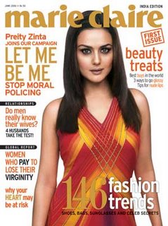
LET ME BE ME- is the tag line of ‘Marie Claire’, a woman’s magazine which is released today in India.

You might be aware that Marie Claire is already being published in 25 countries and the Indian edition is launched by Outlook Group. Inaugural Issue is consisting of 228 pages at the cover price of 50Rs. Inaugural issue is having Preity Zinta on the cover. (Do you remember, agencyfaq was running a contest last month for guessing the cover girl for the inaugural issue?).

Content is largely divided into three sections- People, Fashion & Beauty. Another major content component is ‘for buyers’ which is scattered through out the magazine in pieces. Story contribution for the first issue is pretty good.

Design & layout has lots of experiments (or variations) which doesn’t leave any style impact on readers mind.

I like the idea of putting letters written by the editors of other editions of Marie Claire in the ‘Letters’ section of the first Issue.

Just have a look and share your opinion on the forum.

Regards,
G.S.Virdi

The Man-2

(was written on: May 29, 2006)

Hi Friends,

Remember ‘The Man’? Inaugural issue had Carol Gracious wearing tie (only!) on the cover…!

Finally, after long wait of four months, second issue is released last weekend. Issue is fantastic as earlier one was! I just wanted to share my observations on the same with you guys as follows.

Design is super! It has newness & shows the creativity, which simply makes the daring statement about the product. It is good example of where creativity goes beyond templates and still stays within the boundaries of the brand.

I think, black & white is becoming a style for the lifestyle magazines, as ‘M’ also had black cover for their inaugural issue. In the latest issue of ‘The Man’, Yana Gupta is also in the frame of black & white times. And this B&W impact is not limited up to cover, but you will find it through out the issue. It is looking simply great!

Just have a look the issue and you will have some ideas of playing with Typography in your headlines, in your intros, in your cross heads etc. (I understand that all of our brands don’t allow us to experiment in such a way, still its worth to have a look.) It has done amazing experiment even in opening visuals…!

I also like the way they put the contributors’ introduction in the credit pages, though a few of other magazines also do the same.

It was worth of waiting so long for such a great issue!!

Keep reading!

G.S.Virdi

Content is King(size)!

(was written on: May 23, 2006)

Hi friends,

Do you remember January 06 issue of Cosmopolitan?
Oki…here is the clue- Sush was on the cover…remember?
Oki…another clue- the BIG size magazine…remember?

Hmmmm…Now you got it.

After the great success of that particular issue, another HULK sized issue of this mega-zine is released last week. This issue is superb in terms of visibility having Koena on the cover. You just can’t miss it on news stand even if you are not from its core audience. It works like POP by itself.

In terms of advertisements, content, number of pages, innovations…everything is impressive. This giant & swimsuit special issue consists of 426 pages and is available at 75Rs only!!! I was talking to news stand guy about its sale, and as expected, he was happy with the fast movement.

I think, it’s a great example of coordination and perfect planning of Editorial and Sales/marketing team, because it is just not possible to come out with such a great product otherwise. And that too on the same cover price, which guarantees the higher sale.

Copy of this issue is with me, just in case you want to have a look.
Keep reading :-)