Hi Friends,
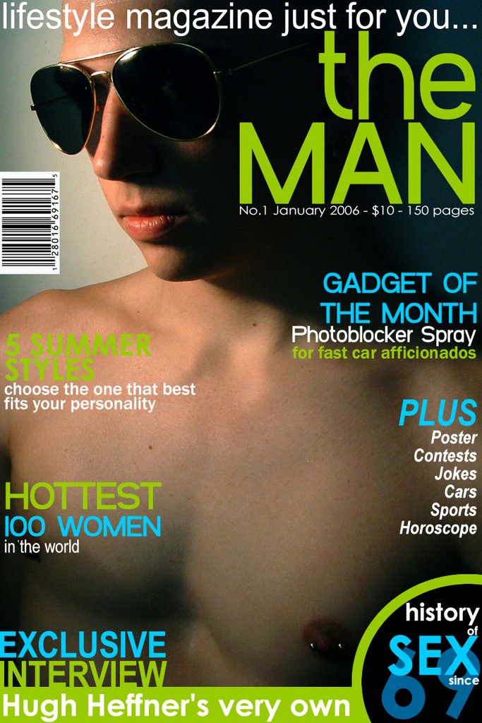
Remember ‘The Man’? Inaugural issue had Carol Gracious wearing tie (only!) on the cover…!
 Finally, after long wait of four months, second issue is released last weekend. Issue is fantastic as earlier one was! I just wanted to share my observations on the same with you guys as follows.
Design is super! It has newness & shows the creativity, which simply makes the daring statement about the product. It is good example of where creativity goes beyond templates and still stays within the boundaries of the brand.
I think, black & white is becoming a style for the lifestyle magazines, as ‘M’ also had black cover for their inaugural issue. In the latest issue of ‘The Man’, Yana Gupta is also in the frame of black & white times. And this B&W impact is not limited up to cover, but you will find it through out the issue. It is looking simply great!
Just have a look the issue and you will have some ideas of playing with Typography in your headlines, in your intros, in your cross heads etc. (I understand that all of our brands don’t allow us to experiment in such a way, still its worth to have a look.) It has done amazing experiment even in opening visuals…!
I also like the way they put the contributors’ introduction in the credit pages, though a few of other magazines also do the same.
It was worth of waiting so long for such a great issue!!
Keep reading!
G.S.Virdi

No comments:
Post a Comment